A landing page should not leave visitors guessing. If someone clicks an ad, email, or campaign link and lands on a page that feels vague, crowded, or disconnected from the promise that brought them there, lead generation slows down quickly. Strong landing page design for lead generation gives people a clear next step, builds confidence fast, and removes the friction that keeps good prospects from reaching out.
For many organizations, the problem is not traffic alone. It is the gap between attention and action. A campaign may generate clicks, but if the page does not align with audience expectations, reinforce credibility, and make conversion feel easy, those clicks rarely become qualified leads. That is why landing pages need to be treated as strategic business tools, not just attractive web layouts.
What landing page design needs to do for lead generation
A high-performing landing page has one primary job: move the right visitor toward one specific action. That action might be requesting a consultation, downloading a resource, scheduling a call, registering for an event, or asking for a quote. Whatever the goal, the page should support that single conversion path with clarity and purpose.
This is where many pages lose momentum. They try to act like a homepage, brochure, portfolio, and sales pitch all at once. The result is too many messages competing for attention. In lead generation, focus matters. A landing page should narrow the visitor's choices, not expand them.
That does not mean every page should look minimal or stripped down. It means every section should earn its place. The headline should confirm relevance. The supporting copy should explain value. Visuals should reinforce the message. The form should feel reasonable. Trust signals should answer the unspoken question every visitor has: why should I believe you?
Start with message match, not decoration
Good design begins before color palettes, typography, or image selection. It starts with message match, which means the landing page should reflect the language, offer, and expectation set by the source that drove the click. If an ad promises a free brand assessment, the page should lead with that offer immediately. If an email invites prospects to schedule a consultation, the page should not bury that option under unrelated copy.
When message match is weak, visitors feel uncertainty. They may not be able to explain why they hesitate, but they do. They wonder if they clicked the wrong link, whether the offer changed, or whether the business really understands their need. Strong alignment creates confidence before the visitor reads much at all.
That is one reason effective landing page design for lead generation is closely tied to campaign strategy. The page is not a standalone asset. It is part of a larger conversation with a specific audience at a specific stage of decision-making.
The anatomy of a page that converts
The most effective landing pages usually follow a logical sequence. First, they confirm what the visitor is looking for. Next, they explain why the offer matters. Then they reduce risk and make action feel worthwhile.
A strong headline is central to that flow. It should be specific, easy to scan, and connected to the visitor's goal. Clever language is less useful than clarity. Business owners and marketing leaders are not looking for wordplay when they land on a campaign page. They want to know whether this page can help solve a real problem.
Supporting copy should expand on the headline without turning into a wall of text. Short paragraphs tend to work better than dense blocks because visitors scan before they commit. That said, shorter is not always better. If the offer involves trust, budget, or a meaningful commitment, people often need more context. A consultation request for a strategic branding project may require more explanation than a simple newsletter signup. The right amount of copy depends on what you are asking the visitor to do.
Visual hierarchy also matters. The page should guide attention naturally, with the most important information appearing first and the call to action remaining easy to find. Good layout is not just about aesthetics. It is about helping people process information with less effort.
Forms should collect enough, not everything
Lead generation forms often fail for one simple reason: they ask for too much too soon. A first interaction is not always the right time to request extensive business details, multiple phone numbers, or a long list of qualifying information. Every extra field creates friction.
The better approach is to match the form length to the value of the offer and the sales process behind it. If someone is downloading a simple resource, a shorter form may produce more conversions. If the goal is to identify serious prospects for a high-value service, asking a few additional questions may improve lead quality. There is no universal rule here. More fields can reduce volume but improve fit. Fewer fields can increase submissions but require more filtering later.
The key is intentionality. Ask only for what your team truly needs at this stage. If a question does not help the next conversation, it probably does not belong on the form.
Trust signals are part of the design
Many organizations treat trust-building content as an afterthought, but it should be built into the page from the beginning. Visitors are evaluating more than the offer. They are assessing credibility, professionalism, and follow-through.
That can include client testimonials, recognizable partner logos, years of experience, awards, certifications, or concise statements about process and results. For nonprofits, associations, and mission-driven organizations, trust may also come from showing community impact or stakeholder alignment. For service firms, it often comes from demonstrating a reliable process and consistent outcomes.
The important point is this: trust signals should support the visitor's decision, not clutter the page. A few well-placed proof points usually work better than a crowded section filled with every possible badge and claim.

Design choices should reduce friction
Strong landing page design for lead generation makes the next step feel manageable. That includes fast load times, mobile-friendly layouts, accessible forms, clear buttons, and visual consistency with the broader brand. If the page feels outdated, difficult to navigate, or disconnected from the rest of your marketing, confidence drops.
Consistency matters more than many teams realize. When your landing page uses a different voice, style, or quality level than your email campaigns, brochures, or website, prospects notice. They may not say it directly, but inconsistency can create doubt about organizational maturity and attention to detail.
This is especially important for businesses and nonprofits trying to build long-term credibility. Every branded touchpoint should support the same story. A landing page is often a prospect's first focused interaction with your organization, and first impressions are shaped by both content and design.
Why testing matters more than assumptions
Even experienced teams can guess wrong about what will convert best. A headline that sounds strong internally may not resonate with the audience. A longer page may outperform a shorter one. A different call-to-action phrase may produce stronger lead quality, not just higher volume.
That is why landing page performance should be reviewed, refined, and tested over time. Useful improvements often come from practical questions. Are visitors dropping off before they reach the form? Is the offer specific enough? Does the page answer the objections your sales team hears most often? Is mobile conversion weaker than desktop conversion?
Testing does not require constant redesign. Sometimes a meaningful lift comes from improving message clarity, adjusting form length, repositioning proof points, or simplifying the page structure. The goal is not to chase trends. It is to create better alignment between visitor intent and page experience.
A landing page should support the sales conversation
Lead generation does not end when a form is submitted. The page should help attract the kind of prospect your team is prepared to serve. That is why strategic clarity matters so much. If the page is too broad, you may generate inquiries that are not a good fit. If it is too narrow, you may exclude strong opportunities.
The best landing pages strike a balance. They are clear enough to qualify interest while still being welcoming and easy to engage with. They connect marketing with sales, strategy with execution, and brand presentation with business development.
For organizations that want more from their campaigns, this is where professional guidance can make a measurable difference. A thoughtful creative partner looks beyond surface-level design and asks the deeper questions: who is this page for, what problem is it solving, what action matters most, and what is getting in the way of conversion?
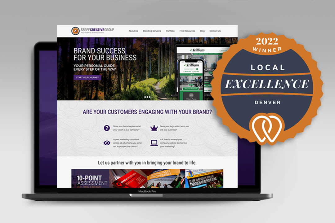
At Serff Creative Group, that kind of thinking is central to the work. A landing page is not just another project deliverable. It is a chance to create clarity, strengthen trust, and turn marketing effort into real momentum.
If your campaigns are bringing in attention but not enough qualified leads, the answer may not be more traffic. It may be a better page, built with the right message, the right structure, and a clearer path forward.