You can usually spot a weak brand identity system before anyone says a word. The logo looks polished, but the website feels like a different company. Sales materials use one tone, social posts use another, and event signage seems pulled from an older version of the business. A practical brand identity system checklist helps catch those gaps before they confuse customers, donors, partners, or your own team.
For many organizations, the problem is not effort. It is fragmentation. Different vendors, different departments, and different timelines create brand materials that look acceptable on their own but fail to work together. That disconnect costs credibility. It also slows decision-making because every new piece has to be debated from scratch.
A strong identity system gives your business a shared standard. It helps leadership stay aligned, gives marketing teams a clearer framework, and makes creative execution faster across print, digital, and environmental applications. If your brand feels inconsistent, this is where to look.
What a brand identity system checklist should cover
A true brand identity system is more than a logo package. It connects strategic positioning with the visual and verbal choices your audience sees every day. If your checklist only covers colors and fonts, it is incomplete.
At a minimum, your system should account for brand strategy, messaging, logo usage, typography, color standards, imagery, layout principles, and real-world applications. It should also define how those elements adapt across channels without losing recognition. That last part matters because a brand that works on a business card but falls apart on a trade show display or landing page is not fully built.
This is also where many organizations make a costly assumption. They believe consistency means rigidity. In practice, a useful system creates consistency through rules and flexibility through structure. Your team should not be guessing, but they also should not feel trapped by guidelines that ignore real marketing needs.
Start with strategy before design
Before reviewing visual assets, step back and ask whether the strategic core of the brand is clear. What do you want to be known for? Who exactly are you trying to reach? Why should that audience choose you over another option?
If those answers are vague, visual inconsistency is often just a symptom. A business that has not clarified its value proposition, market position, or audience priorities will struggle to present itself consistently no matter how many logo files it owns.
Your checklist should confirm that the brand has defined its mission, positioning, audience segments, differentiators, and core promise. For nonprofits, that may also include cause language, donor messaging, and community impact statements. For growing companies, it may include how the brand should evolve as new services or markets are added.
This step is not glamorous, but it saves time later. Design decisions become easier when the brand strategy is settled.
Review the verbal side of the brand
A brand identity system checklist is incomplete without messaging standards. Visuals may attract attention, but language carries trust. If one team writes in a formal corporate style while another sounds casual and promotional, the brand starts to feel unstable.
Look at your tagline, elevator pitch, company overview, service descriptions, and calls to action. Do they reflect the same priorities? Do they sound like they come from the same organization? Just as important, do they match the expectations of the audiences you serve?
Tone should be deliberate. A startup may want to sound energetic and approachable. A healthcare organization may need more clarity and reassurance. A professional services firm may need authority without stiffness. There is no single correct answer, but there should be a defined one.
It also helps to document preferred terminology. If your team alternates between different names for the same service, program, or audience, confusion spreads quickly across marketing materials.
Check the visual foundation
This is the part most people think of first, and for good reason. The visual layer is often where inconsistencies become obvious.
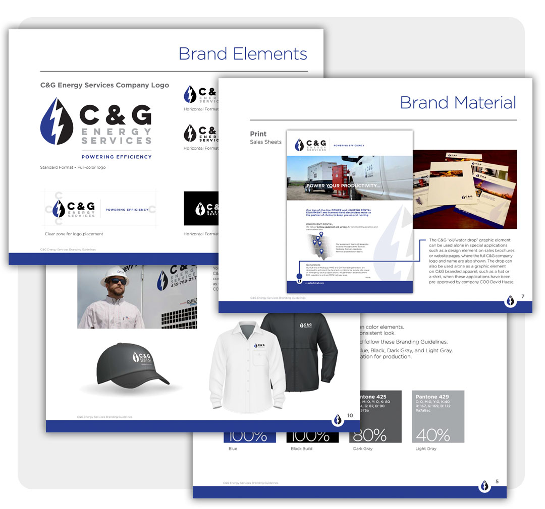
Start with the logo system. Confirm that you have primary, secondary, and simplified versions where needed, along with approved file formats for print and digital use. Make sure there are clear rules for spacing, minimum size, background control, and misuse. If staff members are stretching, recoloring, or improvising logo variations, the system is not being protected.
Next, review color standards. Approved brand colors should include exact values for print and digital production. If every vendor or staff member is estimating the brand palette by eye, results will vary. The same goes for typography. You need a defined type hierarchy, not just a list of acceptable fonts.
Imagery deserves equal attention. Photography style, illustration style, icon treatment, and graphic textures should support the same brand personality. A polished corporate headshot style may clash with highly casual event photos. That does not mean every image must look identical. It means the overall art direction should feel intentional.
Make sure the system works across real applications
A brand is tested in use, not in a style guide PDF. One of the most important parts of any brand identity system checklist is application review.
Look at the places your audience actually encounters your brand. That may include your website, landing pages, brochures, business cards, presentations, direct mail, email templates, social graphics, trade show displays, signage, vehicle graphics, video titles, and internal documents. Are these materials clearly related, or do they feel assembled from different eras of the company?
This is where trade-offs often appear. For example, a visual approach that looks elegant in a printed annual report may be too subtle for digital ads. A color palette that performs well on screen may be harder to reproduce in certain print environments. A good system accounts for those realities without abandoning consistency.
It is also smart to review accessibility and readability. Brand choices should support communication, not get in the way of it. Low-contrast colors, dense typography, or overcomplicated layouts can weaken performance even if they look visually sophisticated.
Brand identity system checklist for internal adoption
Even a well-designed system can fail if no one uses it correctly. That is why internal adoption belongs on the checklist.
Ask who has access to the current brand standards. Are your files organized and easy to find? Does your team know which logos, templates, and messaging blocks are approved? If not, people will default to old versions, personal judgment, or whatever they can locate fastest.
Training matters more than many organizations expect. A short orientation for staff, partners, and outside vendors can prevent months of off-brand output. That is especially important for organizations with distributed teams, multiple departments, or frequent event and campaign work.
Ownership should also be clear. Someone needs responsibility for maintaining the system, updating assets, and reviewing exceptions. Without that accountability, brand standards tend to erode over time.
Signs your current system needs work
Sometimes leaders know their brand feels off, but they are not sure whether the issue is cosmetic or structural. A few warning signs usually point to the answer.
If your team regularly recreates materials instead of adapting existing ones, the system may be too thin. If vendors produce very different work from the same brief, the standards may be too vague. If your audience experiences one personality online and another in person, your messaging and visual execution may be misaligned.
Growth can expose these problems faster. New service lines, new locations, fundraising campaigns, product launches, and website updates all put pressure on the brand. What worked when the company was smaller may no longer be enough.
That is often the right time to seek outside guidance. An experienced creative partner can help determine whether you need a full brand refresh, a clearer standards document, or simply better alignment between strategy and execution. Firms like Serff Creative Group often see that the real need is not more design volume, but a more usable system behind the design.
What to prioritize if you cannot fix everything at once
Not every organization can rebuild its brand system in a single phase. If resources are limited, start where inconsistency causes the most visible damage.
For some, that means clarifying core messaging and updating the website first. For others, it means standardizing logo usage, color, typography, and key sales materials so the brand stops sending mixed signals. The right order depends on where your audience interacts with you most and where internal confusion is costing the most time.
The key is to treat brand consistency as an operational advantage, not just a design preference. When your identity system is clear, teams move faster, vendors produce better work, and audiences experience a stronger sense of trust.
A good checklist does more than audit your assets. It gives you a clearer picture of whether your brand is supporting growth or quietly holding it back. If your materials are telling slightly different stories, that is not a small issue. It is a signal that your organization is ready for sharper alignment and a more confident next step.