A visitor has found your organization, understands what you offer, and is ready to take the next step. Then they cannot read the text, complete the form with a keyboard, or tell which button will move them forward. That is not simply a design issue. It is a missed opportunity to serve a customer, donor, prospect, or community member. This website accessibility design guide explains how to build a more inclusive site while protecting the clarity and consistency of your brand.
Accessibility is sometimes treated as a technical cleanup project handled after a website launches. A stronger approach is to make it part of the design conversation from the beginning. When accessibility informs your brand system, page layouts, content, and testing process, the result is usually a website that is easier for everyone to use.
Why Accessible Design Is a Business Decision
People use websites in different ways. Some navigate with a keyboard rather than a mouse. Some use screen readers. Others need stronger color contrast, larger text, captions, simpler forms, or extra time to understand a task. Temporary limitations matter too: a visitor may be holding a child, using a phone in bright sunlight, recovering from an injury, or watching a video in a quiet waiting room.
For businesses and nonprofits, these details affect real outcomes. If users cannot request a quote, register for an event, make a donation, or find contact information, the website is working against the organization’s goals. Clear accessibility practices can also improve mobile usability, search visibility, content structure, and overall trust.
There is a compliance consideration as well. Accessibility expectations and legal requirements can vary by organization, industry, public funding, and jurisdiction. The Web Content Accessibility Guidelines, often called WCAG, provide a widely used framework. They are valuable standards to work toward, but they do not replace legal advice tailored to your organization. A qualified web and legal team can help you understand the obligations that apply to your situation.
Start With the Brand System, Not a Quick Fix
An accessible website should still look like your brand. The goal is not to make every organization look the same. It is to make intentional design choices that let more people experience your message.
Build color choices around contrast
A brand palette may contain subtle tints, light grays, or bright accent colors that work well in print but struggle on a screen. Text and essential interface elements need enough contrast against their backgrounds to remain readable. A pale gold button with white type may feel refined in a brand presentation, for example, but it can become nearly invisible to many visitors.
This does not mean abandoning a signature color. It may mean reserving that color for decorative accents, using a darker accessible variation for text, or pairing it with a high-contrast background. Contrast needs to be checked wherever color appears: body copy, headings, buttons, links, form errors, charts, navigation, and hover states.
Do not use color alone to communicate meaning. A form field with an error should not rely only on a red outline. Add plain-language text that explains what needs attention. A sales chart should use labels, patterns, or direct values in addition to different colors. These choices help visitors who are color-blind and make information easier to scan for everyone.
Create a hierarchy people can follow
Strong visual hierarchy supports accessibility and brand clarity at the same time. Visitors should be able to tell what a page is about, what information matters most, and where to act next. Use headings in a logical order, rather than selecting type styles only for appearance.
Every page should have a clear primary heading, followed by meaningful sections. Avoid jumping from a top-level heading to a minor subheading simply because the smaller style looks right. A screen reader uses heading structure to help users move through a page, and a well-organized page helps sighted visitors do the same.
Readable typography matters just as much. Very small text, tightly packed lines, thin type weights, and long stretches of centered copy can create unnecessary friction. Your type system should provide comfortable body text, enough line spacing, and a limited number of styles that are used consistently across the site.
Design Navigation for More Than the Mouse
Many usability problems appear when a designer looks only at a static page layout. A website is an interactive experience. Visitors need to move through menus, buttons, forms, popups, and content without guessing what is selected or where the next action leads.
Keyboard access is a practical test. A user should be able to move through the page using the Tab, Shift + Tab, Enter, and arrow keys where appropriate. Each focused element needs a visible focus indicator. Removing the browser’s focus outline may make a layout look cleaner in a mockup, but it leaves keyboard users without a clear location on the page.
Navigation labels should say what visitors will find. “Services,” “Our Work,” and “Contact” are clearer than vague labels such as “Explore” or “Learn More” when they appear without supporting context. On buttons, use action-based language. “Schedule a Consultation” is more useful than “Click Here.”
Be thoughtful with motion and interactive effects. Auto-playing carousels, animated backgrounds, content that appears only on hover, and quickly changing messages can distract or exclude users. Motion can support a brand when it has a purpose, but visitors should be able to pause, control, or bypass it when needed.
Make Content Easy to Understand and Act On
Accessibility is not confined to code or color ratios. It includes the words, images, documents, and media your organization publishes. Clear content respects a visitor’s time and reduces the chance that they will abandon an important task.
Write in direct language, especially near forms and calls to action. Explain what will happen after someone submits information, how long a process may take, and what fields are required. If an application, registration, or donation process has multiple steps, show users where they are and what remains.
Images need meaningful alternative text when they communicate information. A photograph of a community event might be described as “Volunteers sorting food donations at the annual neighborhood drive.” A decorative background flourish does not need the same treatment because it adds no information. The question is simple: if the image disappeared, what would the visitor miss?
Video should include accurate captions. Audio content needs a transcript when the spoken content matters. If a video demonstrates a process visually, consider whether audio description or an accompanying written explanation is needed. These assets also make your content more useful to people who prefer to read, are in sound-sensitive environments, or need to reference details later.
PDFs deserve special attention. Many organizations post brochures, annual reports, menus, applications, and event materials as PDFs. If those documents are not built with accessible headings, reading order, image descriptions, and tagged structure, they can create a barrier even when the main website is well designed. When possible, publish essential information as a web page in addition to a downloadable file.
Treat Forms as a Critical Customer Experience
Forms are where interest becomes action, so they should receive careful design and testing. Every field needs a visible label, not placeholder text that disappears as soon as someone begins typing. Instructions should be located close to the fields they explain, and required fields should be identified in more than one way.
When a visitor makes an error, the form should clearly state what went wrong and how to correct it. “Please enter a valid email address” is far more helpful than a generic red message at the top of the page. Preserve information users have already entered whenever possible. Asking someone to retype an entire form because one field was incomplete is a preventable frustration.
For longer forms, group related fields and break complex processes into manageable steps. The right approach depends on the task. A short contact form may work best on one page, while an event registration or application may benefit from a progress indicator and the ability to save work.
Use a Practical Accessibility Review Process
No single automated scan can confirm that a website is accessible. Automated tools can identify some problems, such as missing image descriptions or weak color contrast, but they cannot reliably judge whether your content is understandable or whether a form makes sense in real use.
A useful review combines automated checks with human testing. Have your team review key user paths: finding a service, reading a page, filling out a form, making a purchase or donation, and locating help. Test with a keyboard. Check the site on a phone. Increase text size. Turn on captions. Ask whether each step still works and whether the message remains clear.
Prioritize the pages and actions that matter most to your organization. If resources are limited, start with primary navigation, high-traffic pages, contact and conversion forms, and essential documents. Then build accessibility requirements into future campaigns, landing pages, email templates, and content updates. That approach is more manageable than waiting for problems to accumulate.
Website Accessibility Design Guide: Questions to Ask Your Team
Before approving a design or publishing a page, ask practical questions. Can someone understand this page without relying on color? Can they use every key action with a keyboard? Does the text remain readable on a small screen? Are headings, labels, and buttons descriptive? Can a visitor recover easily if they make a mistake?
These questions create a better review process because they connect design decisions to customer engagement. Accessibility is not a separate layer added after the brand is complete. It is part of how a credible organization communicates care, competence, and respect.
A website should give every qualified visitor a fair opportunity to understand your organization and take the next step. Begin with one important page or one high-value form, improve it thoughtfully, and let that standard guide every new piece of your digital brand.
Website Accessibility & ADA Compliance Plug-n-Play for Your Website
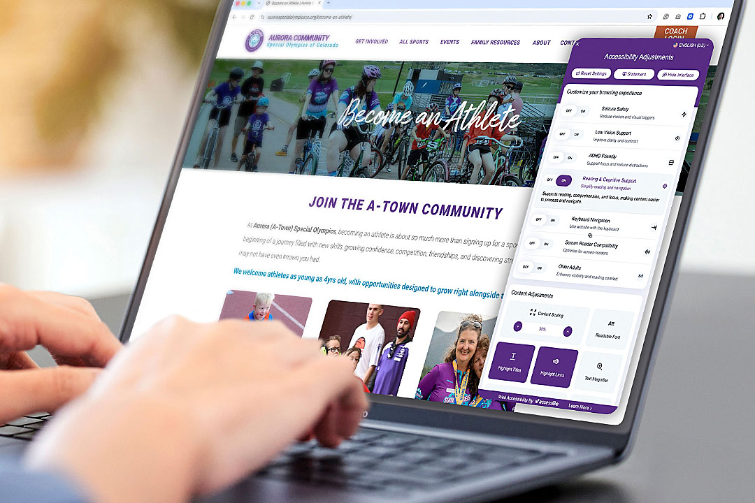
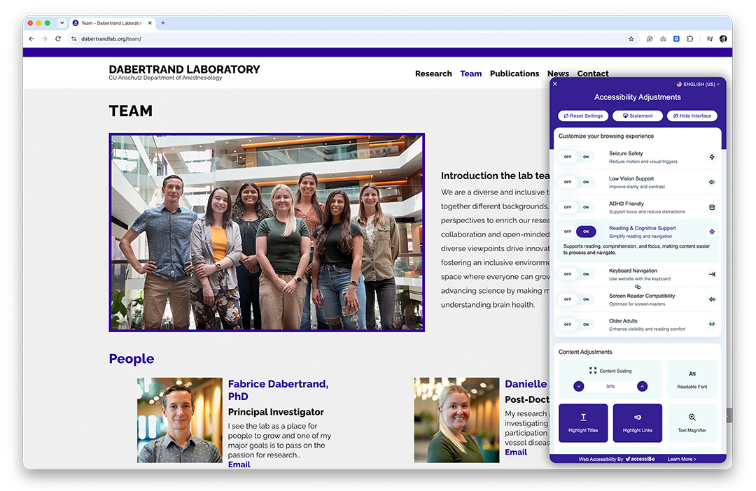
Make your website more accessible and inclusive with a powerful accessibility solution from our trusted partner, accessiBe. We recommend adding website accessibility services to help improve usability for people with disabilities, support accessibility best practices, and create a better online experience for every visitor.
Give every customer a better way to connect with your brand—online and with greater accessibility.